Trash Polka Tattoos: The Complete Guide
Controlled chaos from Würzburg: photorealistic black and grey smashed against bold red graphic elements, splashes, brush strokes and typography.
Trash Polka was created by German artists Simone Pfaff and Volko Merschinsky in Würzburg, and it remains one of the few tattoo styles with named inventors and a manifesto: realism and trash — the photorealistic and the graphic, the ordered and the chaotic — composed into deliberate collision. Black and grey realistic imagery crashes into abstract red shapes, brush strokes, splatters, geometric fragments and bold typography.
The palette is strict: black, grey and red. That discipline is what makes the chaos read as design instead of noise — every trash polka piece is a composed argument between control and explosion, usually across a very large canvas.
Trash Polka at a glance
| Line weight | Smooth black and grey realism collided with bold graphic strokes |
|---|---|
| Palette | Strictly black, grey and red only |
| How it ages | Bold composition survives softening; red is the variable, refresh-prone element |
| Best placements | Full sleeves, backs and whole limbs, composed as a total field |
| Minimum size | Planned by region, not inches; realism faces inside it need 5 inches and up |
How Trash Polka designs are drawn
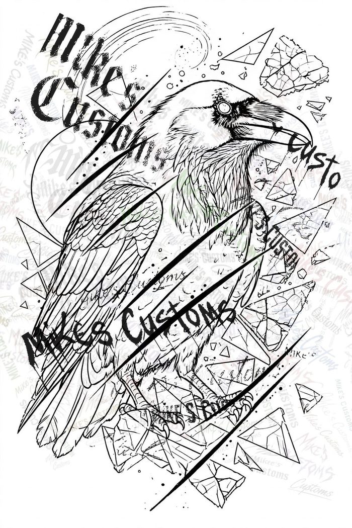
A trash polka design layers two languages. The realism layer — a face, a skull, an animal, architecture — is rendered in smooth black and grey. Over and through it runs the graphic layer: saturated red blocks and streaks, black brush strokes, splatter, halftone dots, and often words set in strong type. Elements overlap and interrupt each other on purpose; the composition is balanced like a collage poster, with the red placed to pull the eye along a planned path.
Best placements for Trash Polka tattoos
Trash polka is a large-format style: full sleeves, backs, chest-to-leg compositions, whole limbs. Its compositions are planned as total fields, not single motifs, and they follow the body's long lines — a design might start at the shoulder and detonate down the arm. Small trash polka exists but loses the style's defining scale contrast; most wearers commit a whole region.
Trash polka placement is composition across anatomy, and its best placements exploit long bones and broad fields together. A full arm lets a portrait sit on the upper arm's flat panel while brush strokes and typography detonate down the forearm, following the limb's length instead of stopping at the elbow. On the leg, a composition can start at the thigh and break across the knee into graphic fragments on the calf, using the joint as one of the style's planned interruptions rather than an obstacle. Back pieces gain a second axis: the spine becomes a dividing line that realism and graphic elements cross deliberately. What does not work is isolating one element, a red streak or a small skull, on a wrist or ankle and calling it trash polka; without the collision of scales the style has no argument. Placement also decides session order, because a region-sized piece is mapped whole even when it is tattooed in parts, and starting in the middle of the field without the full map risks stranding the best flat panel on a minor element.
How big does a Trash Polka tattoo need to be?
Think in regions, not inches: a forearm composition, a half sleeve, a back. The realism elements need the same size realism always needs (faces five inches and up), and the graphic elements need field around them to read as strokes rather than clutter. Trash polka is usually built across multiple sessions, sometimes designed in full first and sometimes grown piece by piece with the composition held in the artist's plan.
How Trash Polka tattoos age
The black and grey realism softens as realism does; the red is the variable — red pigment is famously individual, holding brilliantly on some skin and fading faster on others, and it is the element most likely to want refreshing. The graphic boldness of the style works in its favor: even softened, the composition reads, because the design was built on strong shapes rather than delicate detail.
Red deserves its own aftercare paragraph in this style. Some wearers heal red bright and keep it for a decade, others watch it quiet within a few years, and no artist can promise which skin will do which; a patch of red placed where sun hits daily stacks the odds toward fading. Report any red area that stays raised, itchy or weeping well beyond the rest of the piece rather than treating it at home, because red pigments account for a disproportionate share of tattoo reactions and early advice beats home remedies. The realism layers heal like other black and grey work, soft and cloudy before they clarify, while the graphic black strokes heal like bold linework, so a large piece can look uneven in progress simply because its two languages are on different clocks. Trash polka suits people committing a whole region to one artist's composition and one strict palette. It does not suit collectors who want to add unrelated pieces into the same area later, anyone who may tire of red, or anyone hoping a small version will carry the same force as the large originals the style is known for.
Choosing a Trash Polka design
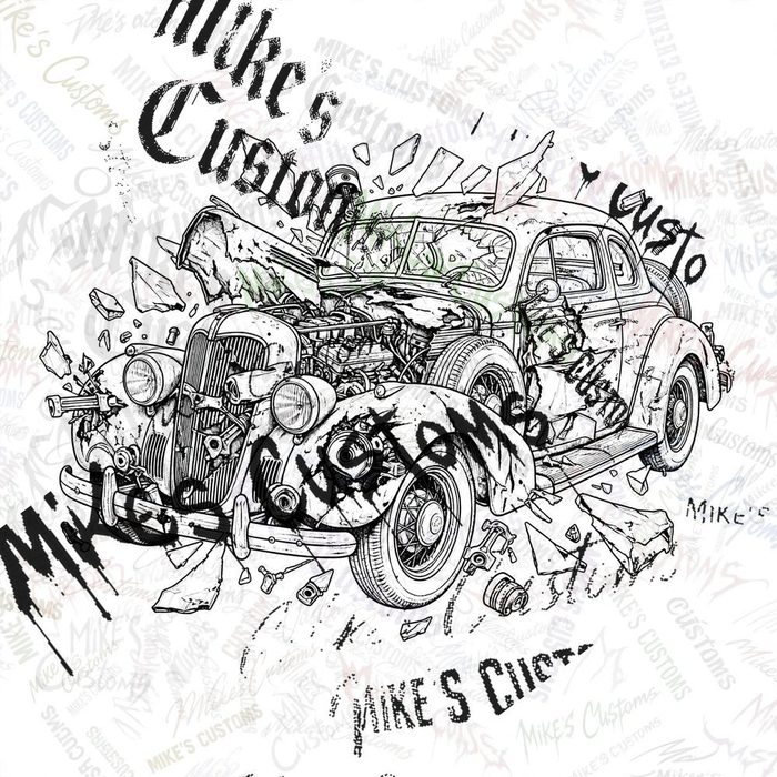
Trash polka is specialist work — choose an artist who tattoos the style, not one willing to try it. Our trash polka designs are composed pieces with the realism and graphic layers balanced; for a full-region composition, order custom and name the region and the subject, and expect a design meant to be tattooed at scale, in sessions.
Browse Trash Polka designs Order a custom Trash Polka design
Related style guides
- Optical Illusion — Tattoos that trick the eye: impossible geometry, 3D cubes and holes, rippling patterns and double images that move, flip or deepen as you look.
- American Traditional (Old School) — The original American tattoo style: bold black outlines, a tight palette of red, green, yellow and brown, and imagery — eagles, anchors, swallows, daggers, roses — built to stay readable for a lifetime.
- Neo-Traditional — Traditional tattooing grown up: the same bold bones, but with a wider palette, softer shading, decorative detail and subjects that range from foxes and owls to full illustrated scenes.
New to all of this? Start with how to choose a tattoo design that ages well, then the complete aftercare guide for what happens after the appointment.